Customizing a Checkbox element
A checkbox is a specific type of two-state button that can be checked or unchecked. It provides a formula with one predefined value if the box is checked, and another predefined value if the box is left unchecked.
Element settings

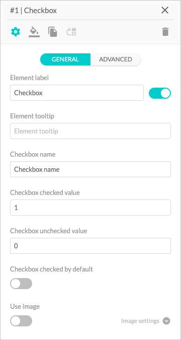
- The Element Label input field allows you to name your element. The toggle controls whether the label is visible or hidden.
- The Element Tooltip is a text field that lets you give more context to each element or explain what information you require to input. Once enabled, it will appear as a small info icon next to the element title.
- You can name the option by using the Checkbox Name input field. It is the text that will appear next to your checkbox.
- In the Checkbox Checked Value input field you can add a numeric value that will be used in your formula if the user checks the box.
- In the Checkbox Unchecked Value input field you can add a numeric value that will be used in your formula if the user leaves the box unchecked.
- The Checkbox Checked by Default toggle controls whether or not the checkbox is checked by default.
- The Use Image toggle allows you to use images as your options. Find a guide here 🔎.