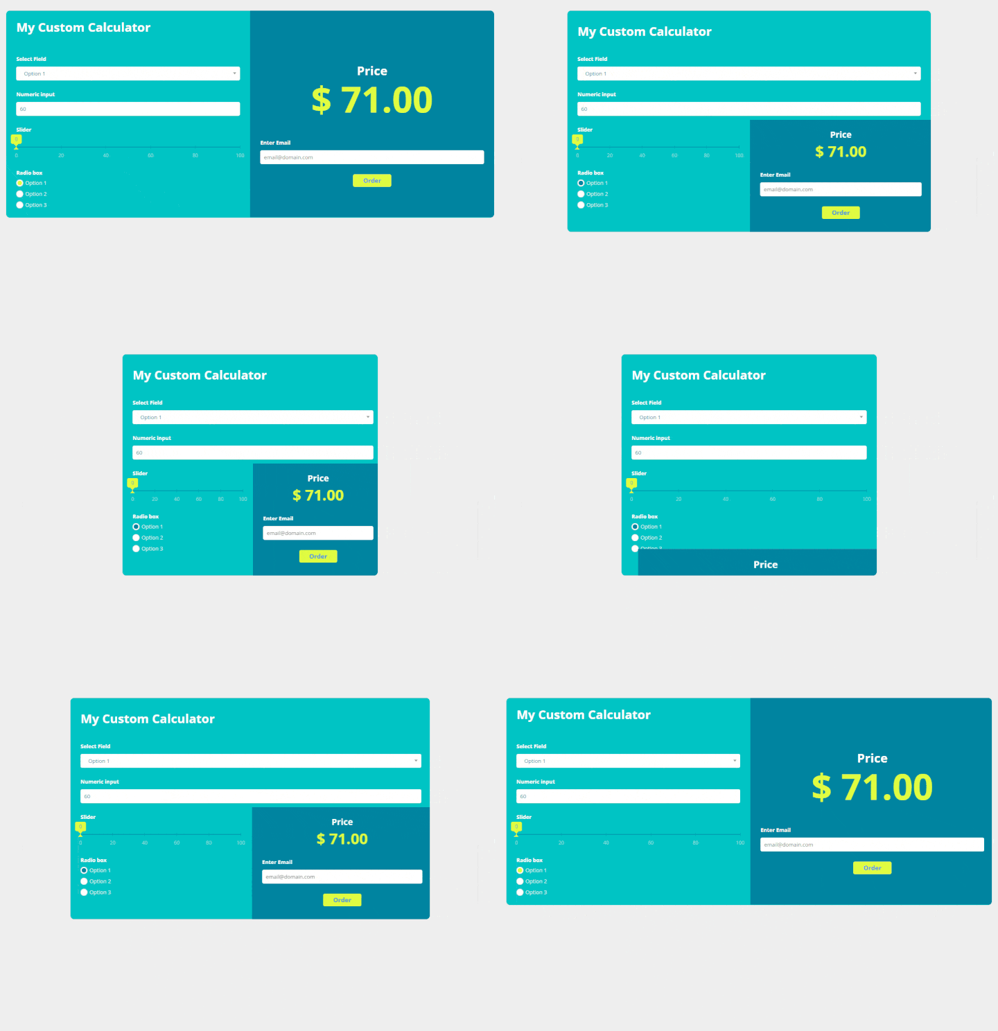
What are breakpoints and how do they work
Calculator breakpoints are the 3 icons at the top of your calculator editor that enables you to set up how your calculator will look on different device screens such as mobile, tablet, and desktop. As website responsiveness is a very important aspect of your website user experience it’s not a topic to miss.
How do you set up different breakpoints?
Each icon represents a different screen size interval so your calculator will adjust itself accordingly if the screen size changes to smaller or bigger.
Click on your preferred device at the top of the calculator editor and design your calculator for the best user experience on it. Don’t forget to save and then move to the next one. We recommend setting up your calculator for all 3 breakpoints.
Once you hover your pointer on any of the device icons, it will show you the width ranges of a device screen or embed container which will display that particular calculator breakpoint.
It is important to keep in mind that the device icons do not necessarily mean that that calculator breakpoint will be displayed on that particular device type.
For example, the mobile or tablet calculator breakpoint can still be displayed on a desktop website version if the embedded container width is smaller than 1024px. Most current website builders and content management systems allow to manipulate container width/size either visually or via CSS.
- The Desktop breakpoint width is anything bigger than 1024px.
- The Tablet breakpoint width is anything in between 1024px and 640px.
- The Mobile breakpoint width is anything smaller than 640px.
All 3 breakpoints are independent modes. The number of elements and their technical specs will stay the same throughout them all but their appearance can be completely different. The most obvious change is the layouts.
Best practices for working with breakpoints
Start from a mobile breakpoint. Once you come up with the design there, arranging it in other breakpoints will be much easier. In the mobile breakpoint, each element is usually stacked vertically, therefore, it guarantees that the layouts will translate well in wider breakpoints.
The tablet and desktop have more freedom in terms of layouts - here you can get more creative and position elements in a horizontal line, have columns, and similar.
If you may have any questions once setting up your breakpoints feel free to contact our support team via email support@calconic.com or using the chat widget in the app.

