Web Calculator Best Practices

Our team has been creating interactive calculators for more than five years.
During this time, we’ve gathered a lot of knowledge and analyzed various web calculator cases. From the best-performing ones to the unfortunate ones that didn’t get the chance to show good results.
We want you to kick off strongly, so in this article Calconic team is sharing the best practices to make sure your web calculator meets your expectations and helps in reaching website goals.
Let’s get into the most important and practical tips on how to make your web calculator effective and achieve results.
Embedding
Where to Embed an interactive calculator?
Your website visitors won’t know if you have an interactive calculator unless you show them. So the first rule is to make it easy to find. Such a calculator will not only make your website visitor stay on the page longer, but may also turn into a conversion point in the customer journey.

So the best places to embed your calculator for visibility:
- Homepage
- Pricing page
- Landing page (above the fold)
- Custom product page
- Popular blog article (evergreen content)
Where to avoid embedding a web calculator?
- Contact us page
- As a link in the text
Let's get to more specific examples. If you have multiple services, the best place to add an interactive calculator is on the landing page of a specific service. This is a relevant location as the calculator supported by your service marketing materials will be your most important customer conversion point.
If you offer a single service, the best place to embed the service pricing calculator is on your website's home page. More traffic means more interactions with your calculator, and more leads and orders.
If you’re thinking about how to embed your web calculator in a specific platform, check our knowledge base guides.
Messaging
Create urgency to use your web calculator
Calculator widgets are meant to attract attention once scrolling through the website, but without good copy or messaging they might get skipped as a decoration or as a flashy marketing bubble.
Here are the basic rules we use when writing copy in our interactive calculators.
- Clear value (what I’ll get)
- Original and concise
- Use Headings with subheadings (short description)
- Urgent wording

Clear value - Every calculator needs a title!
How is your customer supposed to know what your calculator does and why they should use it? Use the title element and state the purpose of the calculator in the most obvious way. Even if it’s just a simple “Price quote calculator”
A few examples:
- Photography pricing calculator
- CBD dosage calculator
- Flooring installation cost calculator
- Tile Quantity calculator
Use Headings with subheadings - AKA information element
Our element list has everything you need, including an information element to let you add a short explanation of your service, process or anything that makes it more interesting for your customers. You can even state the calculation formula (if it is not a secret), that helps in building trust!
Original and concise. That’s the rules to live by. But don’t forget, it’s is not another place to show off your marketing skills, so write only about what’s important in terms of using your interactive calculator and how it’s related to their purchase.
Urgent wording
You can empower your calculator CTA to perform better using urgency wording. Popular phrases for CTA's
- Order now
- Buy now
- Act today
- Claim your discount today
- Book your 'service' now
Urgency can be created using speed wording (now, hurry, instant, today), scarcity (last chance, one day only) and FOMO(fear of missing out - offer expires, final sale)
Design
Styling your interactive calculator
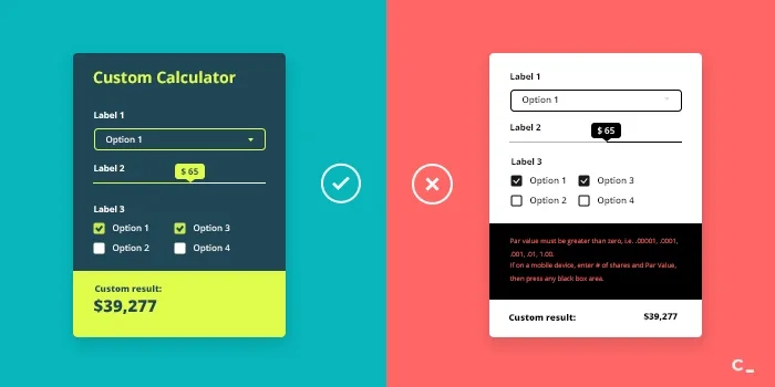
Readability - Similar to newspaper headlines, the font in your calculator title and formula element should be larger than the rest of the text to attract attention. The element labels and the rest of the information fields should be slightly smaller.
The standard recommendation is to not use more than 3 different font sizes throughout the calculator.
Font sizes we use for our calculator templates:
- Title - 20px
- Text - 13px
- Formula (result) - 32px
Colors - Stick to 3 colors, 4 as an absolute maximum.

Even though colors can be a matter of taste, according to color theory, it is not recommended to use more than 3.
Don't use similar colors or neon for the calculator text and background as it will hurt your readability and create eye fatigue.
If you don’t know which colors to use or what would look good with your main brand colors this color wheel by Canva can be a great help. Choose your preferred color and combination type and Canva will generate a color palette with specific color codes that will fit the most.
Don’t forget to highlight your CTA. Your message is important, but ultimately you want your customers to take action. To do this, you need a CTA or call to action that grabs attention. Consider making your CTA a 2-3 word button. And choose a color that pops.
Spacing - no one likes crowded places
The amount of space between elements of your calculator is called padding. Make sure that your calculator has padding at the top and bottom as well as between the elements.
Padding controls can be found in your element settings. You can switch your calculator style toggle from shared (that will apply the same settings to all calculator elements) to custom (which will apply only to that specific element) and really get your calculator to look top notch.
Our recommended padding options:
- 30px at the top and bottom - Set that for the first and last calculator elements (use custom style settings as it applies only to 2 elements)
- 15px between the elements - you can set that using the shared element settings
- 20px from the sides - also set in shared element settings

Responsiveness
Prepare your calculator for all 3 breakpoints
Responsiveness or responsive design is an approach that aims to adapt your website, or in this case calculator preview to different screen sizes. This means when you open your website on a mobile device and a laptop, the layout and design is slightly different because it’s optimized for the best user experience based on the size of the screen that you’re using.
Now this is an absolute must for modern websites and everything added to them.
In Calconic calculator editor you’ll be able to find 3 breakpoints and you need to set up all 3 of them to make your calculator responsive.
- Desktop
- Tablet
- Mobile

Our advice?
Start designing your breakpoints from the mobile breakpoint. Manage how your calculator will look on the smallest screen and then it will be easier going up to bigger screens and more space.
Performance
How to generate traffic with your web calculator?
Calculator as a linkable asset. Interactive calculators can help you and answer even the most complicated public questions. So why not to share it? You can pitch your calculator to websites talking about the problem that your tool solves and suggest linking to your calculator as a useful resource to their readers.
It will also attract links on its own if your calculator counts relevant data to modern users or answers a trending topic. The first source for information to any question is google. Use that to your advantage and stand out by answering those questions with a calculator. A few examples of questions that get asked thousands of times in a day on google:
- How much money do you need to save for retirement?
- How many ounces in a gallon?
- How much should I weigh?

Linkable assets help you generate backlinks because the information is highly relevant to big communities. Keep that in mind when you search for a goof topic.
Here are a few calculators that served as great linkable assets and generated tons of traffic.
- SSS Maternity Benefit Calculator
- Coronavirus Income Support estimator
- Timesheet Calculator
If used wisely, this method can also generate many leads. As your traffic and visibility grow, more people get to know about your website and your service, you only need to include forms that would help you collect user contacts.
In your experience, you've probably encountered at least a few of such calculators on a bank or financial service company websites. Well that's their lead generation tools! A few examples:
- Mortgage calculator
- Loan calculator
- Return on investment calculator
Distribution. You can create the most brilliant content, but it still needs distribution to provide good results. The same is happening with your web calculator.
Calconic has a sharing function so you could share your calculator via social media, add it to your blog posts, create ads and other marketing material that will attract more visitors.
Don’t forget about it.
User experience
Make your calculator easy to use with personalization
“The customer journey is nothing more than a series of questions that need to be answered.” On that note let’s move to the last tips.
Less is always better. When you’re building your calculator don't overcrowd it with information. Use conditional visibility feature to create a personalized experience and show elements based on previous customer inputs.
Element groups
Calconic also allows grouping elements to save space and not overwhelm the user, if the calculator turns out quite big.
Controlled in your calculator settings element groups work with accordion principle and can be expanded or collapsed depending on your set up.

Takeaways
These are web calculator best practices from our team, we hope you found them useful! Remember that the basis of a good calculator starts from knowing your main customer pain-points and appealing to them in the calculator. After that if you use all the tips we provided in this post, your calculator will be programmed for success!
If you want to create a web calculator and have any questions about the process you can always contact our support team at support@calconic.com or check out our knowledge base for answers.

